A call to action (CTA) is a statement designed to spur the reader to action. The most common call to action example is “Buy Now!”, but there are an infinite number of messages and ways to influence your style and tone in a way that best caters to your audience.
One thing is certain for all CTAs, however, and that’s the fact that they always contain an action word—usually in the form of a command. On websites it’s common to see call to actions with the words “follow,” “sign up,” “register,” “subscribe,” “buy,” “download,” “share,” and “click here.” These words urge the website user to take the next step towards becoming a paying client.
A CTA should be a key part of your marketing strategy on your law firm website to get your users to act immediately. It lets users know what the next step in the process is. Don’t assume that visitors will understand what to do after reading your site, or how to connect with you. If you want potential clients to call for a free consultation, let them know! If you’d prefer them to fill out an intake form online, direct them clearly to the form with a clear CTA.
As a service provider, every page of your website should have a CTA. Unlike informational resources, such as a website for the local library, the point of your law firm’s website is ultimately to attract new clients and boost your bottom line. You can’t convert those website users to clients without effective CTAs. If your website doesn’t have a clear call to action, your website is likely incomplete—which may cause you to be missing out on potential clients.
4 Ways to improve your call to action
Think about the websites you’ve been on lately. Have you downloaded an app? Purchased something online? Subscribed to a newsletter? All of these are likely the result of a CTA.
Think about call to action examples that have worked on you personally and you’ll likely find something that might work for people visiting your law firm website.
Ultimately, you want your call to action to be clickable. An easy way to check how strong, urgent, or intelligent your CTAs are is to have a friend read over your website. Would they follow through on your CTAs? Why or why not?
In the meantime, here are four ways you can improve your website’s CTAs, today.
1. Customize your CTA
Your CTA should be tailored to your brand and your clients. Use this opportunity to think about the language that would work best on your potential clients.
What type of law does your firm specialize in? What type of mood are users likely to be in when they visit your website? How can you meet them and offer what they need? These are all important questions to consider when determining the language of your call to action.
Cheshire Law Group focuses on nonprofit work. Their website is designed to make visitors feel like they are the good guys, and their first CTA is “Get to know us,” so that they can prove it. It would make no sense to have a CTA exclaiming “CALL NOW!!” on a website that exudes such a calm, noble feel.

An overly aggressive call to action may cause website users to leave the page forever. That’s a potential cause for losing potential clients, all because your CTA sent the wrong message. Based on the type of clientele Cheshire Law Group wants to attract, and the altruistic organizations they work with, the friendly “Get to know us” is a gentle yet effective CTA that works perfectly with their tagline, “Counsel for good.”
2. Use a hook
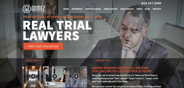
It is always helpful to add a hook to grab your reader’s attention so that they’re more likely to click your CTA. The first thing you see when you open up the Gomez Trial Attorneys homepage is a large orange button that says “Free Case Evaluation”. Since potential clients may be worried about legal costs, the word “Free” instantly addresses their concerns.
While every law firm should reevaluate the language on their website based on their services and target audience, it can be helpful to look at other industries for effective call to action examples as well.
On Dropbox’s website, there is a big blue button that says “Try it Free” with the words “No credit card needed” underneath. Dropbox is removing as many barriers as possible to make it even more enticing to use their product. Not only can you try it for free, but you can also get access to the product without having to drop credit card information. In this modern age where it feels like you have to hand out personal information to get access to anything, this is a welcome relief and may be the extra push users need to get them to decide.
For law firms, deciding to offer a free consultation can be an intriguing way to lower barriers to clients hiring you.
While some law firms require users to fill out a form connected to their client intake software as the first point of contact, others encourage a phone call. How easy do you want to make it for users to contact you? I encourage a lower point of entry to convert site visitors to potential clients.
3. Segment your site visitors
Not all who visit your law firm’s website are alike, and you may want to create different CTAs designed for different groups. For example, PayPal offers a split screen with two different CTAs, each for its own type of customer. From the very first page, PayPal segments its personal and business site visitors so that it can better serve them later on. This is helpful in circumstances where your firm has more than one specialty and wants to segment potential clients right from the start.
Why not tailor your website directly to what a potential client needs? If you have more than one specialty, or more than one type of client, using more than one CTA might be appropriate to segment users and offer a more relevant experience. Your real estate transaction clients don’t want to see content directed at probate clients. Keep the two separate and offer a better user experience overall.
4. Make your CTA stand out
Spotify’s homepage is incredibly bare compared to most other websites. The website simply states: “Music for everyone. Millions of songs. No credit card needed.” The CTA button is also simple: “Get Spotify Free.”
Why is this effective? Because they assume users already understand what Spotify offers. They don’t go into detail explaining how music streams, because they assume that users who have reached their website already know how, and are ready, to stream music. Instead of clutter and superfluous language, they have a clear call to action button.
Your law firm’s homepage will likely have more language since the average user has limited knowledge of the law, but we can take guidance from the clarity of the CTA button on Spotify’s website.
Their CTA button stands out: While the background of the website features warm colors, the button is bright green.
This button is a good example of appropriate color contrast and size. Every CTA button, no matter the website, should be immediately obvious. Don’t make visitors to your law firm website search for the next action. Make the button appropriately large and in a contrasting color that can easily be seen.
Create a strong CTA, attract more clients
These tips outline some clear best practices for improving CTAs on your law firm website, but it’s important to remember that there’s no one-size-fits-all solution. You will need to examine the type of clients your law firm looks for and what will resonate with them to come up with CTAs for your own website.
Whatever CTAs you choose, make sure they reflect your law firm. Your brand should be present in all your marketing efforts. Don’t use brash language if that’s not true to your law firm. You don’t want potential clients expecting sassiness when actually your firm is more reserved.
Your CTA, like the rest of your website and all your marketing materials, should fit in with your brand and make sense for potential clients visiting your site. Create a relevant and effective call to action that spurs site visitors towards the first step to becoming your client.
We published this blog post in April 2019. Last updated: .
Categorized in: Marketing


