When you’re ready for prospects or clients to take action, you need a lawyer landing page. Distractions, such as navigation bars and social media share buttons, are put aside, as your page focuses on a single goal: to get your visitors to book a consultation, purchase your service or sign up to your email list.
What is a landing page?
When you click an ad, a link in a promotional email, or a social media profile bio link, you often “land” on a page you wouldn’t have otherwise found. It’s not part of the website’s navigation bar. It looks different from other pages on the website. You won’t find links to other pages, or any requests to share the page on social media.
The page has one goal – to get you to convert. Meaning, the page aims to convince you to take a single action. Ideally, that action will change your status with the company:
- Buy a product. You’ll convert from a prospective client to a paying client.
- Fill out a contact form. You’ll convert from a website visitor to a prospect or a lead.
- Sign up for an email list. You’ll convert from a website visitor to a subscriber.
Marketing jargon calls this type of page a landing page. Once the page is free from distractions, the company behind it can focus on quickly building trust and emotional connections with you.
- Companies establish trust on landing pages when they showcase impressive stats and professional experience. They can show that people prospects trust, such as celebrities or industry leaders, trust this company.
- Companies establish emotional connections on landing pages when they write copy that shows they understand a prospect’s situation. Among others, companies might express compassion and a promise for the type of future that prospects want.
If the company is successful in keeping you focused, trusting and connected, you are more likely to convert.
How to define landing page success
To define landing page success, companies first set a clear conversion goal (For example, getting a certain amount of new paying clients in a quarter). Then, they measure different data points. They might measure how much time visitors spend on their landing page, to verify it’s enough to give their page a chance. Importantly, they measure what percentage of people who visit the page complete the desired action. This is better known as a conversion rate.
3 use cases for a lawyer landing page
Whether you use ads, social media, blogging or PR to drive ideal clients to take action, you should create a separate landing page for each situation. This is especially important if you’re targeting multiple client needs or multiple stages in the buying cycle.

Source: Strategic Criminal Defence
It takes minutes to create a landing page and as a result, you get a powerful lead generation tool.
Use your lawyer landing page to sell services and products
Some prospective clients want to buy a legal service right now. A growing number of consumers want access to online legal services, such as subscriptions and membership sites. They don’t necessarily want to book a call, wait, and only then have the option to purchase your service. They want to buy when it’s most convenient for them and often need self-service options. You’ll need a separate lawyer landing page for these prospects as the copy and call to action will need to be very different.
Use your lawyer landing page to generate leads
Some prospective clients are almost ready to buy but need to talk to you first to verify that your firm is a good fit for their needs. Direct these prospects to a lawyer landing page where they can ask for more information or schedule an initial, free consultation.
Use your lawyer landing page to get email signups
Not all prospects are ready to buy yet. Some are looking to learn more about a topic before booking an attorney. Getting them on your email list ensures you can stay in touch with them and gradually build trust so that when they’re ready to buy, your firm will be the obvious choice.
To encourage email signups, offer a free ebook, guide, checklist, webinar participation, or even a discount for one of your services or products.
You may like these posts
9 key components of a lawyer landing page that converts
A lot goes into optimizing a lawyer landing page for success. Following are nine key strategies that will make it easier to build trust and emotional connections, and generate conversions.
1. Focus all your lawyer landing page efforts on driving prospects to take one single action
At first glance, many pages on a website might aim to drive prospects towards a single action, but few actually do.
Around the article you’re reading right now, there are multiple calls to action, inviting you to download a guide and read more content. There are also links to other pages on our site in our top and bottom navigation bars. These strategies are intentional; in our blog, we want to give you the option to decide what you do next. A landing page has one specific goal—book a consultation, buy a service or a product, or sign up for your email list, for example—and should do everything it can to nudge visitors towards that goal. No other distractions, calls to action or navigation bars need to be there.
2. Use your lawyer landing page to create a seamless experience
Clients clicked through from your ad (or Instagram story or the sidebar of your blog) for a reason. The first thing they need to realize on your lawyer landing page is that they’ve reached the right destination.
This is the time to continue the experience that enticed them to click.
- Answer questions your ad raised
- Back up claims your ad made
- Show them how you’ll fulfill what your ad promised
Plus, use similar branding to the ad or other item that got their attention.
- Use the same colors
- Present visuals that align with the visuals in your ad or story, if there were any
- Continue with the same tone of voice and phrases
If you use Google ads, you can use Google’s Quality Score tool to check how the combination of the landing page experience you provide, your ad relevance, and clickthrough rate impact the user experience.
3. Include trust signals in your lawyer landing page
Whether you’re still developing your lawyer reputation, or your law firm already has an established brand name, assume that you still need to build trust with new prospects considering hiring you as a lawyer.
The fastest way to start building this trust is to add trust signals to your landing page:
- Showcase logos of recognized clients
- Add logos of publications that have featured you
- Share results you’ve driven for clients (after getting client approvals)
- Feature testimonials from happy clients. Include the clients’ full names and pictures whenever possible, or screenshot reviews from trusted review sites or social media platforms
- Mention awards you have won.
You don’t need to use all these tools for every lawyer landing page. Choose the ones that show the greatest impact you can make or the ones that are most relevant to this specific landing page.
4. Keep website usability best practices in mind when developing your lawyer landing page
Some people will review your entire lawyer landing page, but most people will pay most of their attention to what you feature above the fold—the visible area they see on screen before they have to scroll down. And the most valuable real estate is in the top left corner, according to CXL
Therefore, use the space above the fold to feature key elements that will encourage visitors to either take action right away or to keep scrolling:
- Start your lawyer landing page with a benefit-driven headline that showcases your unique selling proposition.
Source: Berry Law Firm via Crisp Video
- Write a short copy that expands on the headline.
- Present a high quality visual, that doesn’t look too much like a stock photo. Take the extra time to find photos that look more authentic. Alternatively, feature a photo of the lawyers in your firm.
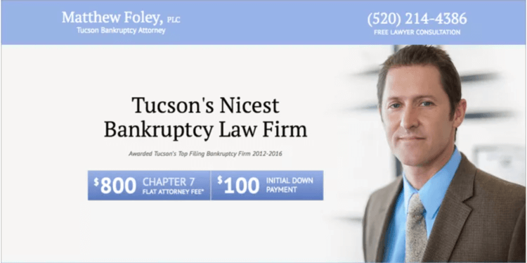
Source: Matthew Foley via Inbound Law Marketing
Once visitors to your lawyer landing page are done with the content above the fold, they’ll likely read, or scan, the content in an “F-pattern,” as explained by CXL:
- Start at the top left
- Move horizontally toward the right side of the page
- Transition left and down again
- Read horizontally toward the right side of the page
- Go back left and down once again

Source: Nielsen Norman Group via CXL
5. Show prospects that end up on your lawyer landing page why taking this action is in their best interest
Every lawyer landing page needs to explain what prospects will get if they take action. But a highly effective lawyer landing page goes beyond a legal service’s features and explains why these features matter to prospects.
For example, don’t just detail how you help clients prepare a will. Explain the benefits at each step, such as making the process pain-free, and ensuring clients’ loved ones will be taken care of in all possible scenarios.
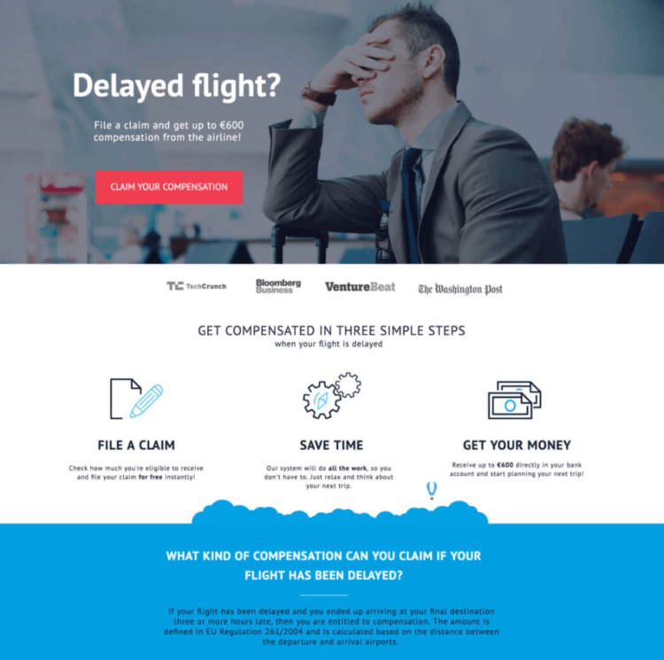
Source: ClaimCompass via Unbounce
In his book, Cashvertising, Drew Eric Whitman suggested following this formula when writing your copy:
Tension => desire => action to satisfy the desire.
For example, here’s how you might use this formula when creating a landing page for will preparation services:
- Highlight prospects’ current tense situation. They know their loved ones are not protected in case something happens to them. Maybe it’s been a nagging task on their to-do list for years because it feels so overwhelming. Maybe they’re already going through a medical challenge. On top of trying to fight an illness, they now realize they need to get their assets in order.
- Show them you understand their desire. Using compassion and avoiding any blame, show prospects that you’re on their side. Then, explain how your legal service can help them overcome this challenge, and make the process simpler or faster than they might assume it is. Alternatively, share testimonials or case studies that prove how thorough you are, and how you managed to protect clients’ loved ones in complex asset situations.
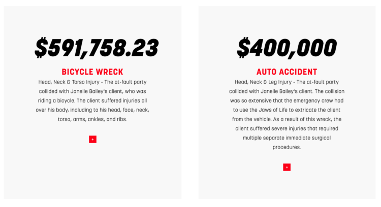
Source: Washington Injury Law via Day Law Library
- Invite them to take action. Ask visitors to fill out a form to request a free consultation, so that they can get the assistance they need.
6. Minimize form fields on your lawyer landing page (or don’t)
The more fields on your contact form, the fewer conversions your lawyer landing page will generate. A long contact form may:
- Overwhelm prospects
- Raise privacy concerns.
Visitors may leave filling out the form to a “later” time that never comes, or click back to Google to look for competitors, forgetting about your lawyer landing page altogether.
Often, it’s better to get prospects to talk to you first, then let them share their information when they’re ready.
To follow best practices for a simple contact form, only include requests for a prospect’s name and email address. You can add fields for comments, a last name, and a phone number, but keep them optional. The phone number field especially tends to be a big barrier for conversion, as some prospects worry they’ll get sales calls.
However, sometimes a longer form is better. This can work if you:
- Choose to qualify your leads better, especially if your firm is well known, and you prefer to minimize the number of leads you get, or if you’ve been wasting the few resources your firm has on non-qualifying prospects.
- Include quick contact information, such as your phone number, on your lawyer landing page in addition to the form. This way, a prospect that feels overwhelmed by the form, but still wants to reach out, can.
In a longer form, you can:
- Leave space for prospects to share their desired outcome.
- Require they choose the most relevant service or product from a menu.
- Allow them to ask for a specific response language if your firm offers services in multiple languages.
If you serve business clients, you can also:
- Inquire about the company‘s size or its budget for this partnership.
- Consider asking for the company’s name, or at least its industry.
- Get clarity on any hard deadlines they might have.
7. Pay attention to your lawyer landing page’s call to action button
Many websites just throw a quick “submit” or “contact us now” button at the bottom of their landing page, then move on. But this is a lost opportunity.
First, this practice highlights that your lawyer landing page is about getting something from visitors, instead of giving them a solution to a problem they have. Second, it overlooks the power your call to action button has to keep building trust and emotional connections with prospects.
To use this tool better, use your button copy to:
- Remind them what they’re getting
- Remind them of the result they’ll experience
For example, if the result you promise for writing a will is that loved ones’ future will be secure, consider these options for a call to action:
- Secure your loved ones’ future
- Let’s secure your loved ones’ future together
- Yes, I’m ready to secure my loved ones’ future
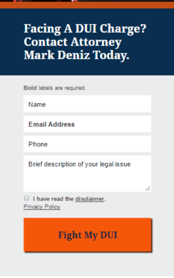
Source: Mark Deniz via Instapage
You can also add copy around your button to remind prospects it doesn’t have to be a long, complicated process. If you’re targeting more complex cases, quickly remind them that you have experts that specialize in such cases.
8. Ensure your lawyer landing page is compliant with GDPR
To stay compliant with the General Data Protection Regulation (GDPR), it’s essential to:
- Add a checkbox at the bottom of your form requesting consent to your privacy policy
- Make your privacy policy easy to find
- Include a clear statement that prospects’ data is safe with you
- Follow GDPR guidelines to ensure their data is indeed safe with you
9. Continually test and refine your lawyer landing page
With so many elements to your lawyer landing page, it’s hard to know which ones make a positive impact on conversions, and which ones cause visitors to decide not to click the call to action button.
The best motto for optimizing your lawyer landing page to its maximum capacity is: Don’t guess—test. Talk to your website developer about the best way to test different elements on your page. For example:
- Compare different options for the same element. For example, different copy or color on the call to action button, different headlines in the same spot, different visuals above the fold.
- Add and subtract elements. Test what happens with fewer or additional form fields, with a video versus without a video, or any other element you’re unsure of.
Your lawyer landing page is an essential part of growing your firm
A lawyer landing page is an opportunity to build trust, show prospects their needs come first, and spark an initial emotional connection. It’s a chance to show them you understand their challenges, and have what it takes to help them achieve their desired results.
Simultaneously, your lawyer landing page is an invitation to start a conversation. Encourage your prospects to talk to you (or sign up for your newsletter) without overpromising things you can’t deliver. Then, when they do, you have the opportunity to over-deliver and create a satisfied customer.
We published this blog post in February 2017. Last updated: .
Categorized in: Marketing


